


Two days ago, a clip about Manchester City’s transfer strategy went viral. Around 7.5 million views on X.

The clip is an excerpt from A Beautiful Obsession, Amazon Prime’s documentary on the club. In it, City’s process for replacing Kevin De Bruyne is described as analysts taking a large set of metrics and melting 43 of them down into 7.
A lot of the replies were asking roughly the same thing: why would City show this publicly?

The answer is that they haven’t really given away the secret sauce. We don’t know their exact variables, their data or how the final ranking is constructed. But the statistical idea behind what they’re describing is actually pretty standard.
Which got me thinking: with the data I have, how close could I get?
So that’s what I did. I took eight seasons of data on every player in Europe’s top five leagues, built a statistical fingerprint of peak De Bruyne, compressed 43 metrics into seven dimensions, and asked the data a simple question:
Which player in 2024/25 looked most like peak Kevin De Bruyne?
The model was allowed to answer whatever it wanted.
Out of 673 players, it answered: Rayan Cherki.
The player Manchester City actually signed.
Here’s what I’m going to do: explain what those “43 metrics into 7” actually means, rebuild the process in R, see why Cherki comes out on top, and then look at where the model stops and human scouting takes over.
1. The problem: how do you replace Kevin De Bruyne?
First, some context on the professional problem, because “replace Kevin De Bruyne” is a genuinely hard one.
De Bruyne left City in the summer of 2025 after ten years. For most of that decade he was the best creative midfielder in the world. You cannot walk into a shop and buy another one.
What a modern recruitment department can do is search systematically. Clubs like City sit on enormous databases: every pass, carry, shot and duel, for tens of thousands of players, going back years.
That creates the opposite problem. Too much information.
A single season of one player’s data contains dozens of plausible metrics. Key passes. Expected assists. Progressive carries. Through balls. Which ones matter? How do you compare a player who is elite on twelve metrics with one who is elite on fifteen different ones?
The clip’s answer: you don’t compare 43 numbers. You compress them into seven, and compare those.
That compression step has a name.
2. How to turn 43 metrics into 7
The technique the clip describes is, in all likelihood, some form of dimensionality reduction. The classic version, and the one I will use, is called Principal Component Analysis, or PCA.
Think of each metric as a question you ask about a player. How often does he pass into the box? How often does he carry the ball forward? How many chances does he create?
Ask 43 questions and you will notice something: many answers move together. A player with lots of key passes usually has high expected assists too, and plenty of shot-creating actions. Those are three questions, but they are mostly measuring one underlying trait: this player creates chances.
In other words, 43 metrics do not contain 43 independent pieces of information. The real information lives in a handful of underlying traits, and each metric is a noisy reading of one or more of them.
PCA is the algorithm that finds those traits automatically. It looks at which metrics move together across hundreds of players and builds new, compressed variables called components. Each component is a weighted blend of the original metrics, and the first few components capture most of the information in the whole table.
Or in plain English: PCA turns 43 (possibly) correlated columns into a few uncorrelated ones while losing as little information as possible.
The clip says City’s analysts ended up with seven. So seven is what I will use.
3. Rebuilding City’s search
Before doing that, one obvious limitation. I do not have City’s data, their 43 metrics, their preprocessing, or their similarity function. Nobody outside the club does. What I can rebuild is the type of workflow the clip describes, using data available outside club walls. The purpose is to understand the method, not to claim access to City’s model.
So I fired up R.
The data. My dataset is Opta event data, aggregated to season-level statistics. It covers the top five European leagues across eight seasons, 2017/18 to 2024/25. Roughly 2,700 player-seasons per year.
The target. I defined “peak De Bruyne” as his five seasons with at least 20 full matches played: 2017/18, 2019/20, 2020/21, 2021/22 and 2022/23. Pooled together, that is about 139 matches of football, converted into per-90 rates. This deliberately excludes his injury-wrecked 2018/19 and his final two declining seasons.
The 43 metrics. I picked 43 variables covering everything the data can see about an attacking player. All are per-90 rates or percentages. The full list, grouped:
Passing (12): key passes, expected assists, expected assisted goals, passes into the penalty area, crosses into the penalty area, passes into the final third, progressive passes, progressive pass distance, pass attempts, pass completion %, long-ball attempts, long-ball completion %.
Pass types (3): through balls, switches of play, crosses.
Shooting (5): non-penalty xG, shots, shots on target %, xG per shot, average shot distance.
Chance creation (5): shot-creating actions, goal-creating actions, and shot-creating actions arising from live passes, from take-ons and from shots.
On the ball (13): touches, attacking-third touches, penalty-box touches, take-ons attempted, take-on success %, carries, progressive carry distance, progressive carries, carries into the final third, carries into the box, ball losses, passes received, progressive passes received.
Defending (2): tackles plus interceptions, attacking-third tackles.
Duels and pressure (3): fouls drawn, ball recoveries, aerial duels won %.
Why 43? Honestly: because the clip said 43. It is an editorial choice matching the narrative, not a claim that these are City’s variables.
The comparison pool. Every midfielder and forward in the top five leagues in 2024/25 with at least 15 full matches. That is 673 players.
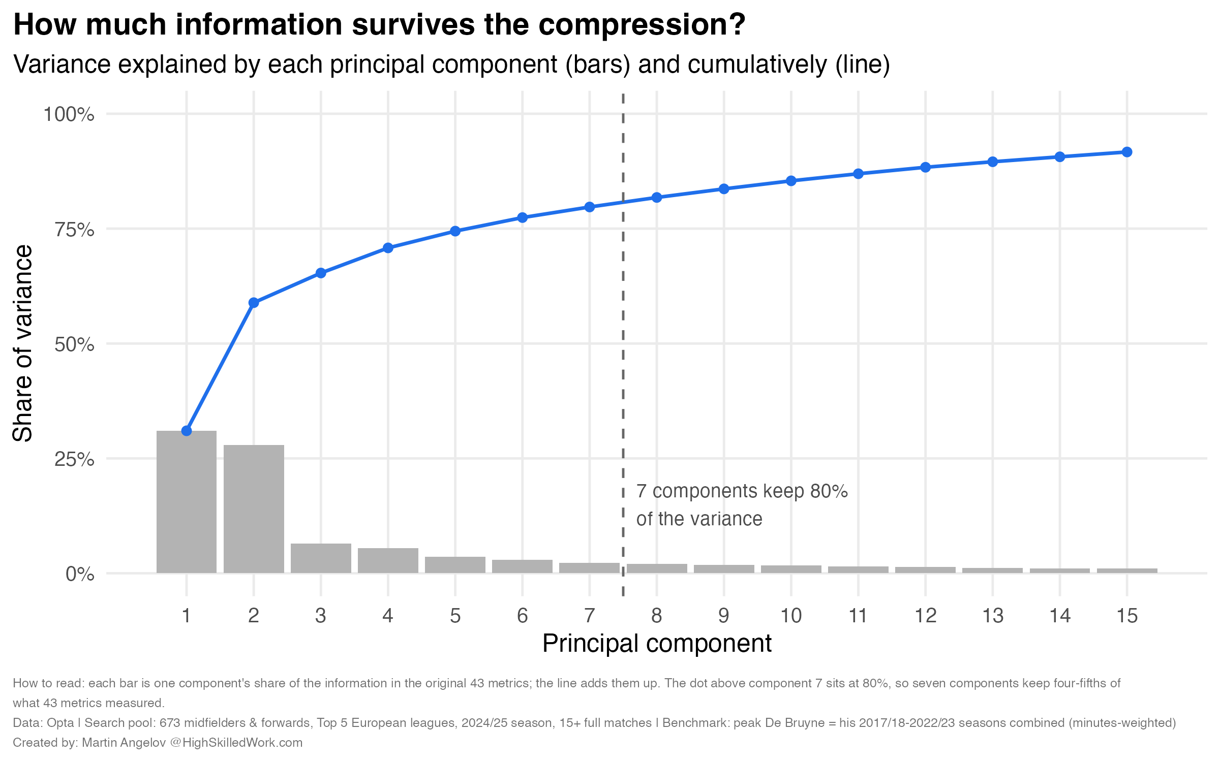
The compression. Standardize each metric so no variable dominates just because of its units, then run PCA. The first seven components retain about 80% of the variance in the original 43 columns. In other words, seven numbers per player preserve roughly four-fifths of the information contained in the original 43. That is the “melting.”
What the seven dimensions are. Each component groups metrics that tend to move together across the 673 players. Looking at which metrics load most heavily on each one, here is my reading of what the algorithm found:
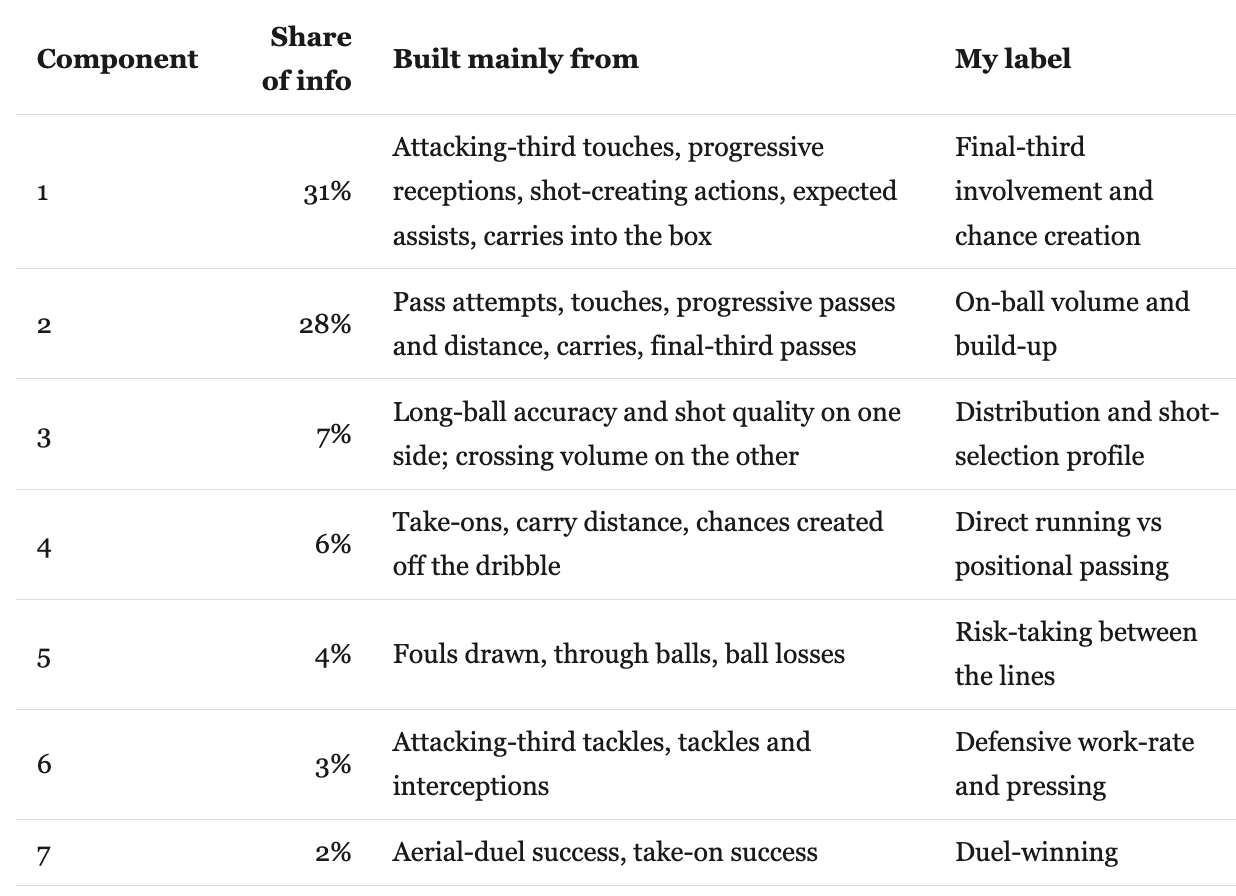
The labels in the last column are my interpretation of the loadings, and a different analyst might word them differently.
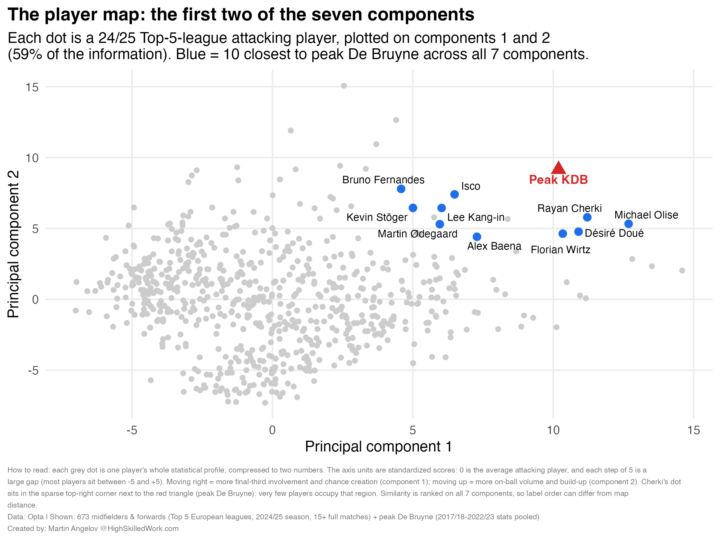
The search. Project peak De Bruyne into this seven-dimensional space, then measure the straight-line distance between him and each of the 673 players. Smallest distance = most similar statistical profile.
And that's basically the process described in that one line of the clip.
4. The closest match: Rayan Cherki
Here is the top of the leaderboard.
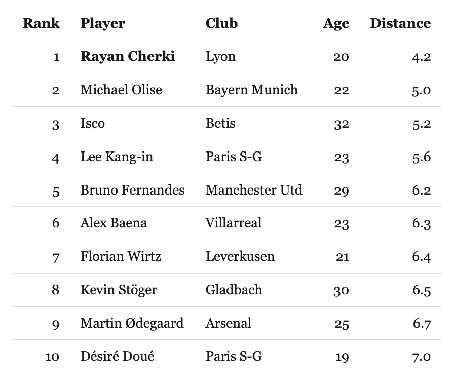
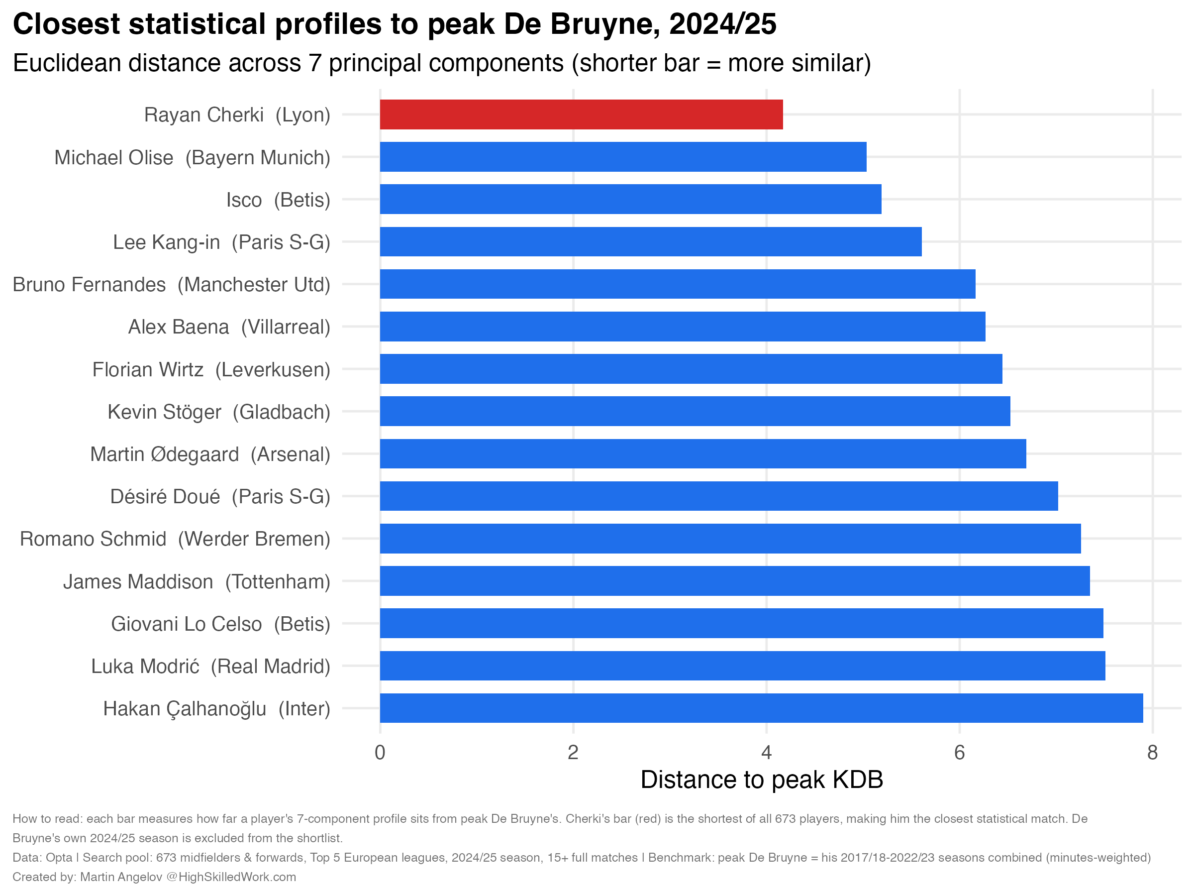
Out of 673 players, a 20-year-old at Lyon had the closest statistical profile to peak De Bruyne in Europe, in the exact season before City signed him.
What does a distance of 4.2 actually mean? On its own, nothing: the units are abstract. It becomes meaningful with reference points. The median player in this pool sits at a distance of about 15 from peak De Bruyne. Pick two attacking players at random and they are typically about 7.5 apart from each other. So Cherki’s 4.2 means he is closer to peak De Bruyne than two ordinary attacking players are to one another. Only five players in Europe came within a distance of 6.
And the names immediately behind him — Olise, Wirtz, Ødegaard and Bruno Fernandes — are reassuring. The model is clearly picking up the type of creative profile we would expect.
Where does Cherki actually match De Bruyne, metric by metric? The chart below compares them in z-scores: how many standard deviations a player sits above or below the average attacking player, where zero is exactly average, +1 is better than roughly 84% of the pool, and anything beyond +2 is elite territory.
On chance creation, they match almost perfectly: key passes, expected assists, passes into the box and through balls are all three-to-five standard deviations above the average attacking player, for both of them. Where they differ is the delivery mechanism.
Peak De Bruyne got the ball into the box with crosses and raking switches of play. Cherki does it off the dribble, with more take-ons and more touches inside the box, and does less defensive work than even De Bruyne’s famously modest amount.
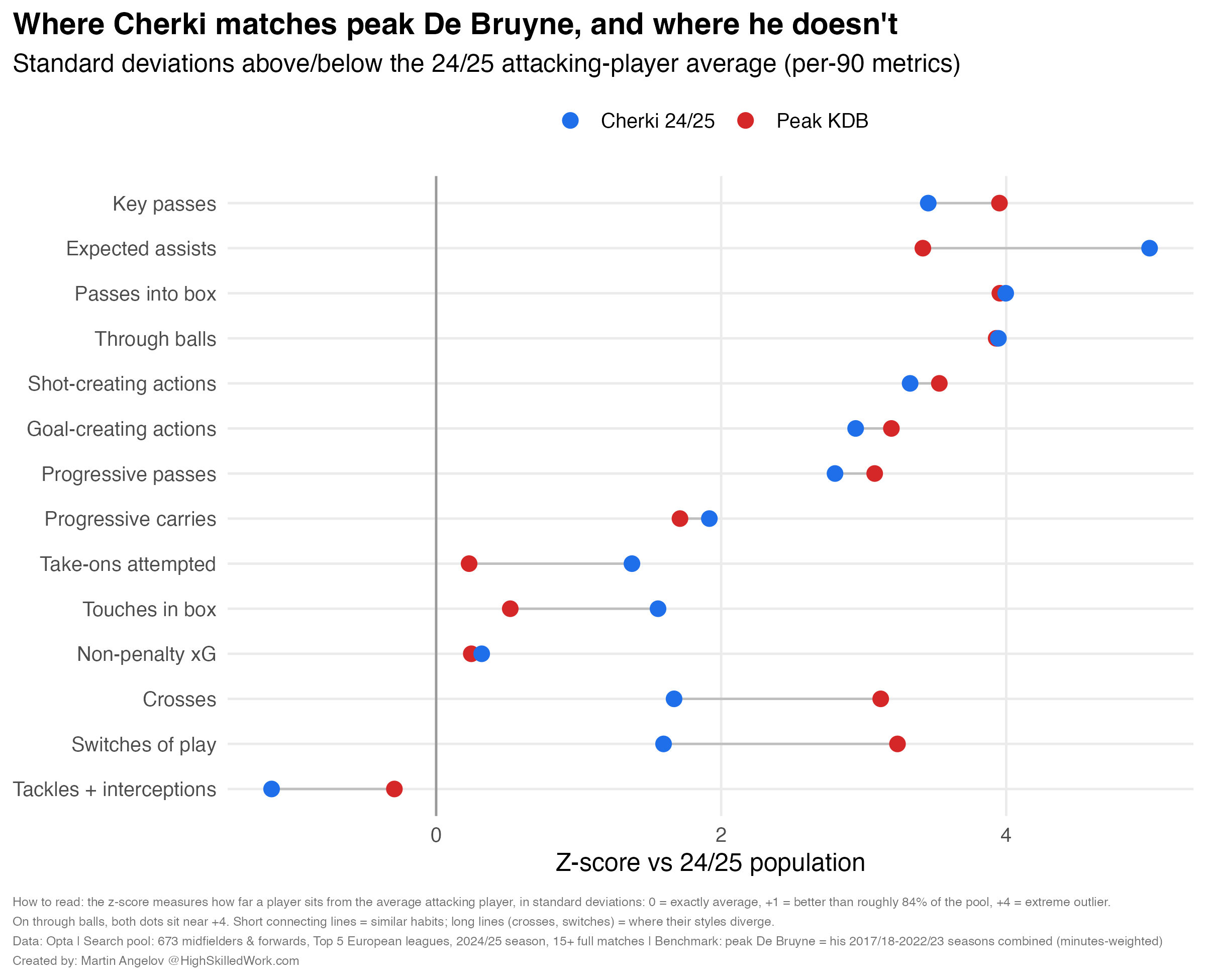
Same creative output. Different route to it. That’s an important nuance and we will come back to it.
5. Did I just get lucky?
Cherki coming first this cleanly made me suspicious. There are plenty of choices in this analysis that could affect the ranking, so I reran it under several different specifications.
Number of components: with 3, 5, 7, 10 or 15 components, Cherki is first every time.
Minutes threshold: at 10, 15 or 20 full matches minimum, Cherki is first.
Definition of peak: if I scrap the “peak seasons” choice entirely and pool all eight De Bruyne seasons, injury year and decline included, Cherki is still first, and the top ten barely reshuffles. The two versions of the reference profile turn out to sit almost on top of each other, mostly because the peak seasons already contain three-quarters of his career minutes.
Overall, in this data, under this family of specifications, Cherki’s 2024/25 season simply is the closest thing to peak De Bruyne that existed in Europe’s top five leagues.
6. What the model cannot see
This obviously doesn't mean City's decision was made by an algorithm. If anything, the clip shows the opposite: the model appears to have been a way of narrowing the search before the much harder human work began.
A similarity score is where recruitment starts, not where it ends. My model knows nothing about:
Physical and tracking data. Distances, sprints, off-ball movement. City has it; season-level event data does not.
League context. Cherki’s numbers were produced in Ligue 1, De Bruyne’s in the Premier League. A per-90 profile does not automatically translate across leagues: opposition strength, tempo and tactical norms differ, and a club would adjust for that.
Tactical fit. Cherki played as a free-roaming creator at Lyon. Can he play in City’s positional structure? A statistical profile cannot answer that. Scouts watching hundreds of hours of footage likely can.
Mentality and references. Cherki had a reputation as a brilliant but inconsistent talent. Clubs interview coaches, teammates, staff (as the clip shows). None of that is in any dataset.
Overall, the metrics say Cherki creates like peak De Bruyne, but through take-ons rather than crosses and switches. A naive reading says “perfect replacement.” A professional reading says “elite creator with a different delivery mechanism, who will need a different tactical environment.” Maybe that’s why the analysts expected Cherki to reach peak De Bruyne level (and style?) in two years time.
7. The model finds the shortlist. Humans make the decision.
City aren’t using the model to make the decision. They’re using it to make the search manageable. Start with thousands of players, reduce the information into something you can compare, produce a shortlist, and then spend human time investigating the players who survive that process.
That structure is not specific to football. It is just the example here. A huge part of high-skilled analytical work is exactly this: use data to shrink the problem, then spend expensive human judgment where it matters.
The viral clip made 7.5 million people feel they had glimpsed something super confidential inside Manchester City.
And yet, there isn't really a magic model. There is a fairly standard statistical tool sitting inside a much larger recruitment process.
So, did we recreate Manchester City’s search?
Obviously, this isn’t City’s model. But with previously (😅) public data, PCA and about five hundred lines of R code, one could reproduce the idea described in the clip — and the model landed on the same player (😮💨).
What I couldn’t reproduce is probably the more valuable part: everything City knew about Cherki that isn’t sitting in my dataset.
Boom — that was the behind-the-scenes look at the tool elite clubs use to shortlist players.
Thank you for reading all the way to the end. I hope you enjoyed reading it as much as I enjoyed creating it.
What better way to spend a summer vacation, right? And the Premier League (❤️) starts in a couple of hours. What a great day.
Talk soon,
Martin
P.S. This post was AI-assisted (editing and code debugging). But not all em dashes were, I promise.